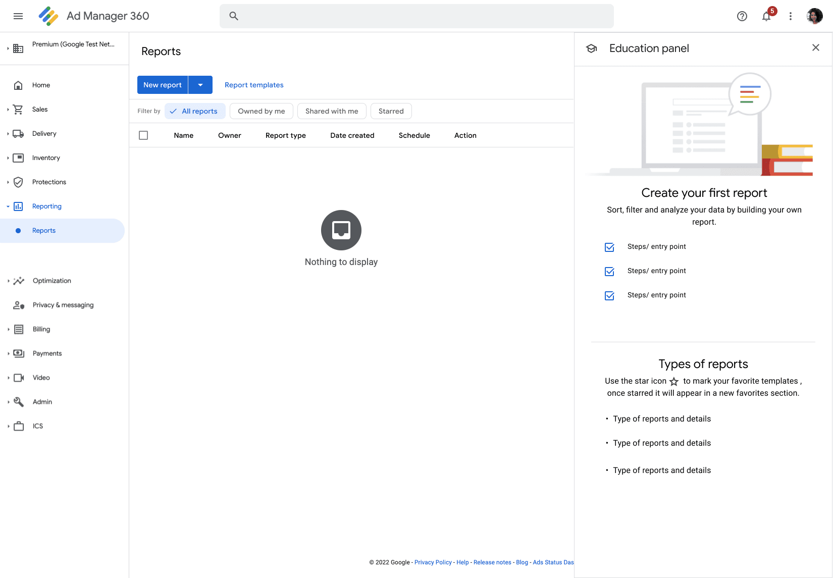
The exploration of zero states were great for first time users. It acts like an empty canvas, informing users why there's nothing there and often suggesting actions on how to fill it up
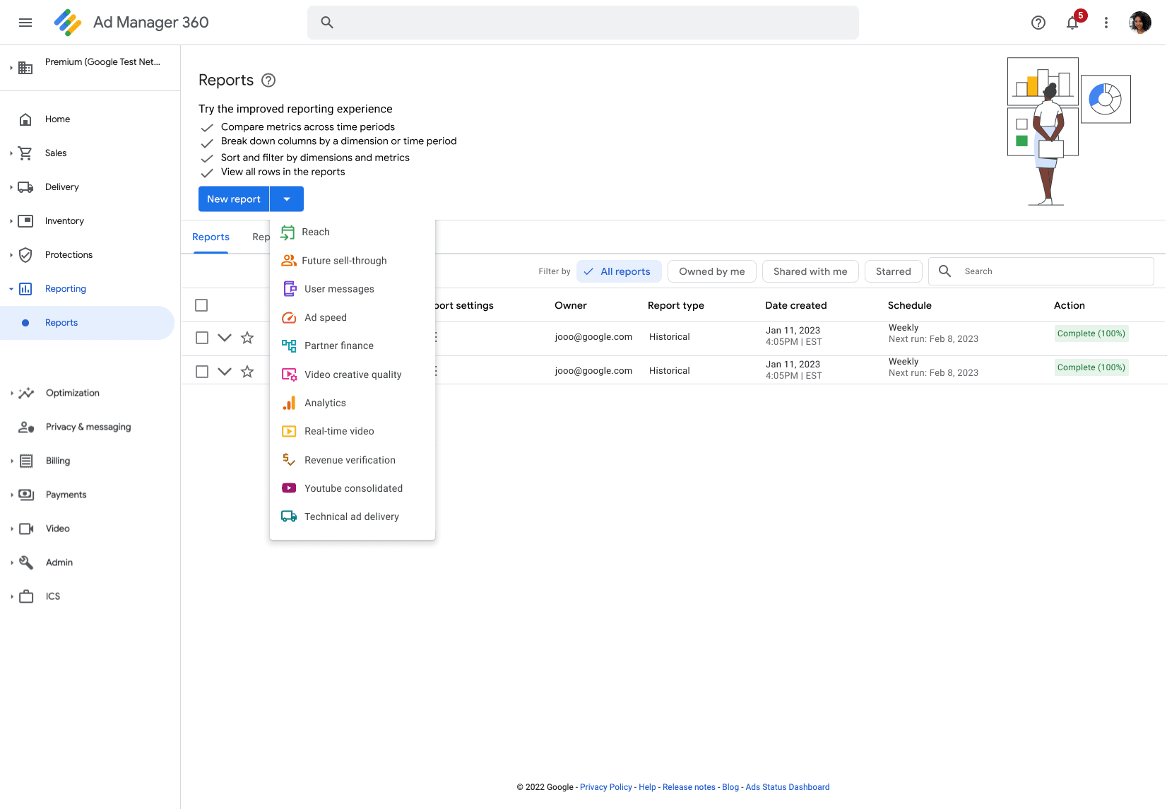
I also added in our report templated cards to the top of the page (a feature that was updated in the QTI phase) so users could quickly select templates they wish to use
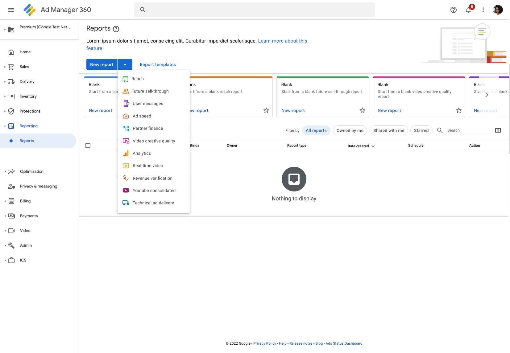

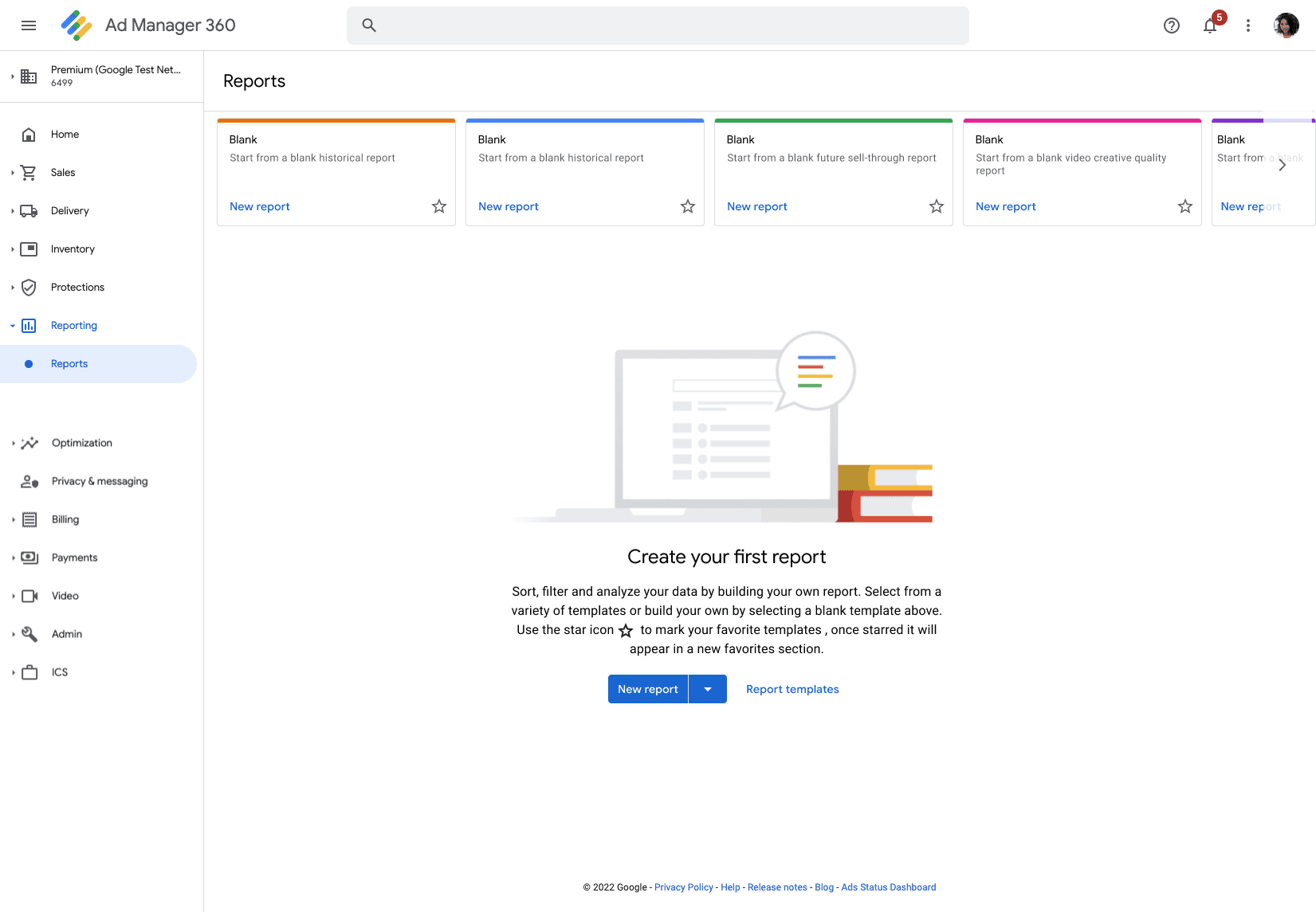
I presented these options to the team one focused on searching and the other incorporating the recommended reports. From here I continued to refine the design for my team incorporating in feedback from each round below shows some of my explorations
My team provided me with a ton of great feedback from my early explorations. Our engineers expressed interest in zero states and liked how I was able to incorporate the templated cards. They recommended instead of having the blank templates we try recommended templates so users feel encouraged to try reports others in their network are using. We also thought it might be interesting to have a way for users to search report templates by county, inventory type and more.


Landing Page experience
Led the development of a user-centric landing page to introduce new features, emphasizing an educational and informative design approach.

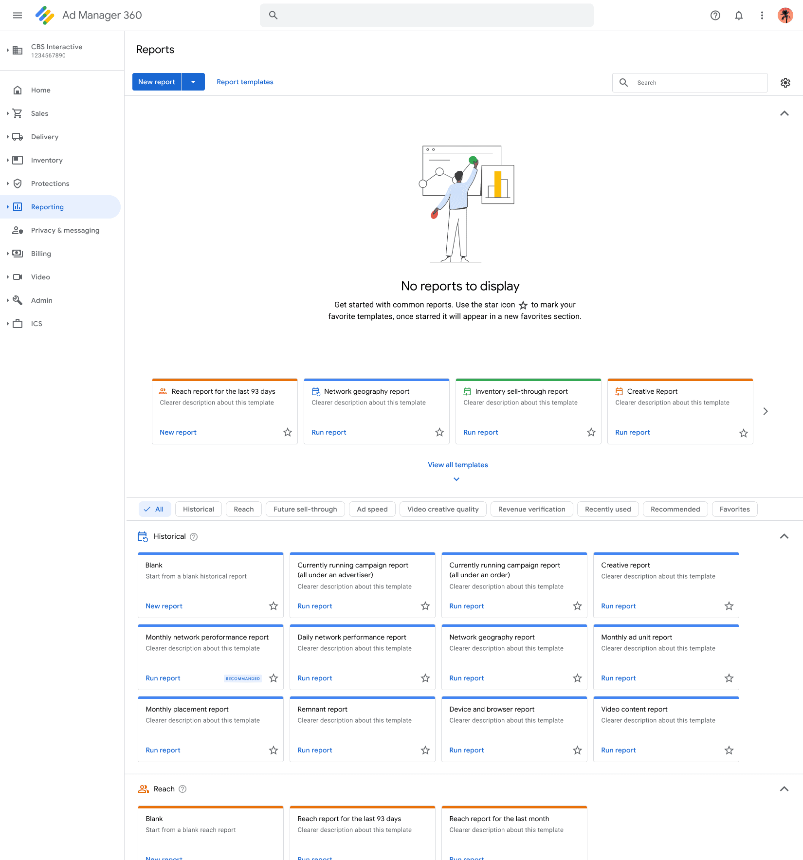
Final designs
After another round of feedback and designing we were able to come up with the designs below. This flow keeps the users journey simplistic, while educating new users and showcasing some of the amazing improvements made to the tool.

What if we incorporate our new
enterprise illustrations

The header is used to educate users about the changes in the feature improving our communication with our publishers
Users are able to select from the report templates, similar to blank templates users are able to use as a foundation for creating reports
Easy access to the report templates page increasing discoverability
Friendly illustration to soften the perceived complexity of GAM, making it feel more approachable
New users will go directly to the report templates page but in the event they want to view the recent reports page they will be redirected to get started in report templates
Use case: Users with reports, searching for and creating a report from the report templates page
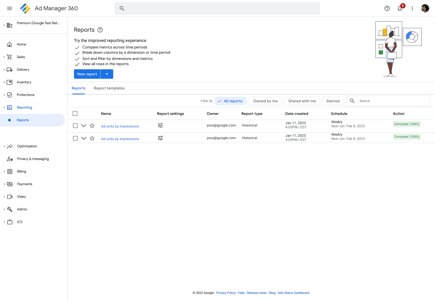
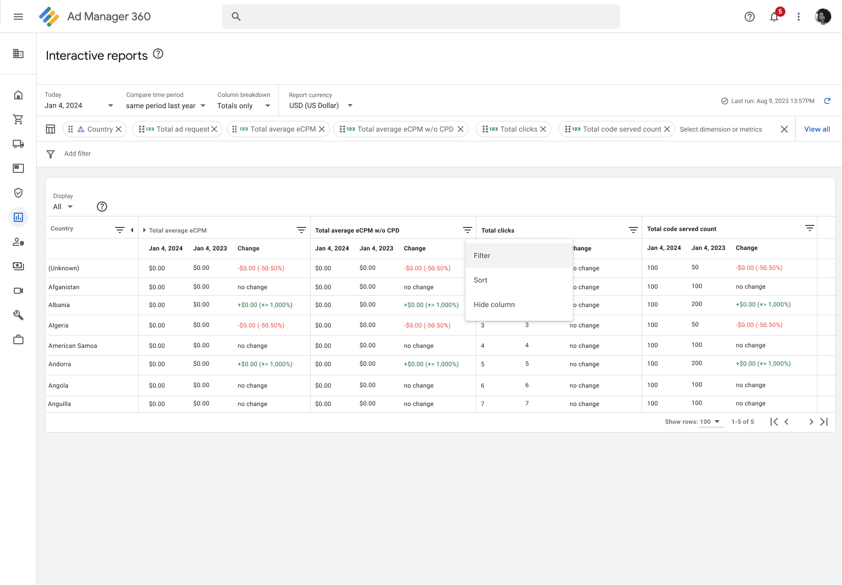
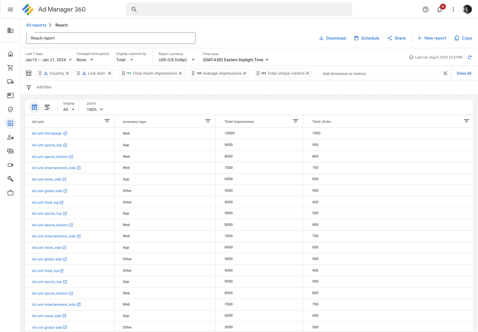
Users with reports will land of the reporting page and are able to see any reports they have created
Users are able to use the "New report button or the report templates page to configure a new report

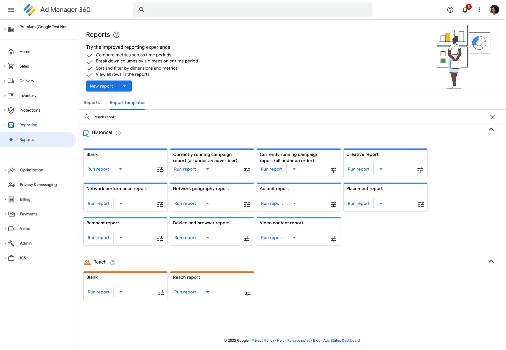
On the report templates page users are able to hover over the settings icon they will be able to see the dimensions and metrics associated with each report template
Users are able to search for a specific report template with guidance from helpful and educational filler text within the search box


Once the user finds the report template they wish to run users can select the dropdown arrow to configure the time period they wish to run the report for.
Users are able to select from an array of time periods or configure their own time period and select “apply and run”
Once users select "apply and run" the report they will be brought to the report completing this part of the users journey


The Feature: We revamped the reporting feature to allow publishers to quickly and efficiently sort, filter and analyze their data to fit their needs.
The Opportunity: The current report page creates a lack luster first impression and fails to showcase the tool's valuable updates for new and returning users. Additionally, it lacks clear guidance, leaving users unsure of where to begin. The opportunity here is to elevate the user experience by designing a friendly yet educational landing page that highlights the improvements made to the QTI tool
The Product: Google Ad Manager (GAM), provides a one stop solution for publishers to manage and optimize their ad revenue. GAM provides ads infrastructure to the largest and most complex companies in the world.
